01 · Overview
Making Muawin's credit infrastructure available to other companies.
Muawin had proven its micro-lending model: field agents making small loans to retail store owners. The next growth lever was to let partner companies (a grocery delivery app, a ride-hailing service) embed credit inside their own products, running on Muawin's rails. Their users would apply without ever leaving the partner's app. Most would never know Muawin existed.
I designed the product end to end: the API contract partners integrated against, the approval logic that decided which cases a machine could clear and which needed a person, and the internal portal where our team worked the rest. Four months in, it was 40% of company revenue and 30,000+ transactions a month.
02 · The Problem
What does product design look like when the product is invisible?
The end user would never see a Muawin screen. They would apply inside an app they already used and either get the money or not. Every surface a designer normally works with (onboarding, screens, copy) belonged to the partner.
My design surface sat a layer down: the system between systems, and the internal tools for the people running it.
Three tensions that couldn't all win at once
Partner simplicity vs. credit data quality
Partners wanted to send a name, a phone number, maybe an ID, and get a yes or no back. Credit needs more signal than that. Every field we required improved our decisions and shrank the pool of partners willing to integrate.
Approval speed vs. default risk
Users applied mid-task, ordering stock or fueling up. They would not wait a day for an answer, and speeding up approvals by loosening scrutiny meant more defaults.
Backlog throughput vs. review quality
Some cases genuinely needed a human. But every case in the queue was a person waiting inside a partner's app, and a queue that blew the same-day SLA burned partner trust.
The core insight: the API contract set what the engine could automate. The automation rate set how much volume hit the review queue. Queue throughput decided whether partners could trust the SLA. Three problems, one system: every decision rippled through all of it.
03 · System Design & The API Contract
The architecture is the design artifact.
In a consumer product, the deliverable is screens. In an infrastructure product, the deliverable is the system itself: how data flows, where decisions happen, and who (or what) makes them.
Most fintech products have a lender and a borrower. This one had three parties: the partner (whose app the user was in), the end user (borrowing), and Muawin (lending). The foundational design work was the contract between them: what data moves where, who sees what, who answers when something breaks.
The core flow
- 1
Partner app
End user applies inside the partner's interface. The partner collects the required data and calls Muawin's API.
- 2
Muawin API
Validates the payload and runs it through the credit scoring engine.
- 3
Approval engine
Three outcomes: auto-approve, auto-deny, or route to a human.
- 4
Disbursement
Approved requests trigger a transfer to the user or, in later integrations, straight to a supplier.
- 5
Repayment
Collected through the partner's payment rails or Muawin's own.
The first integration: a major grocery delivery app
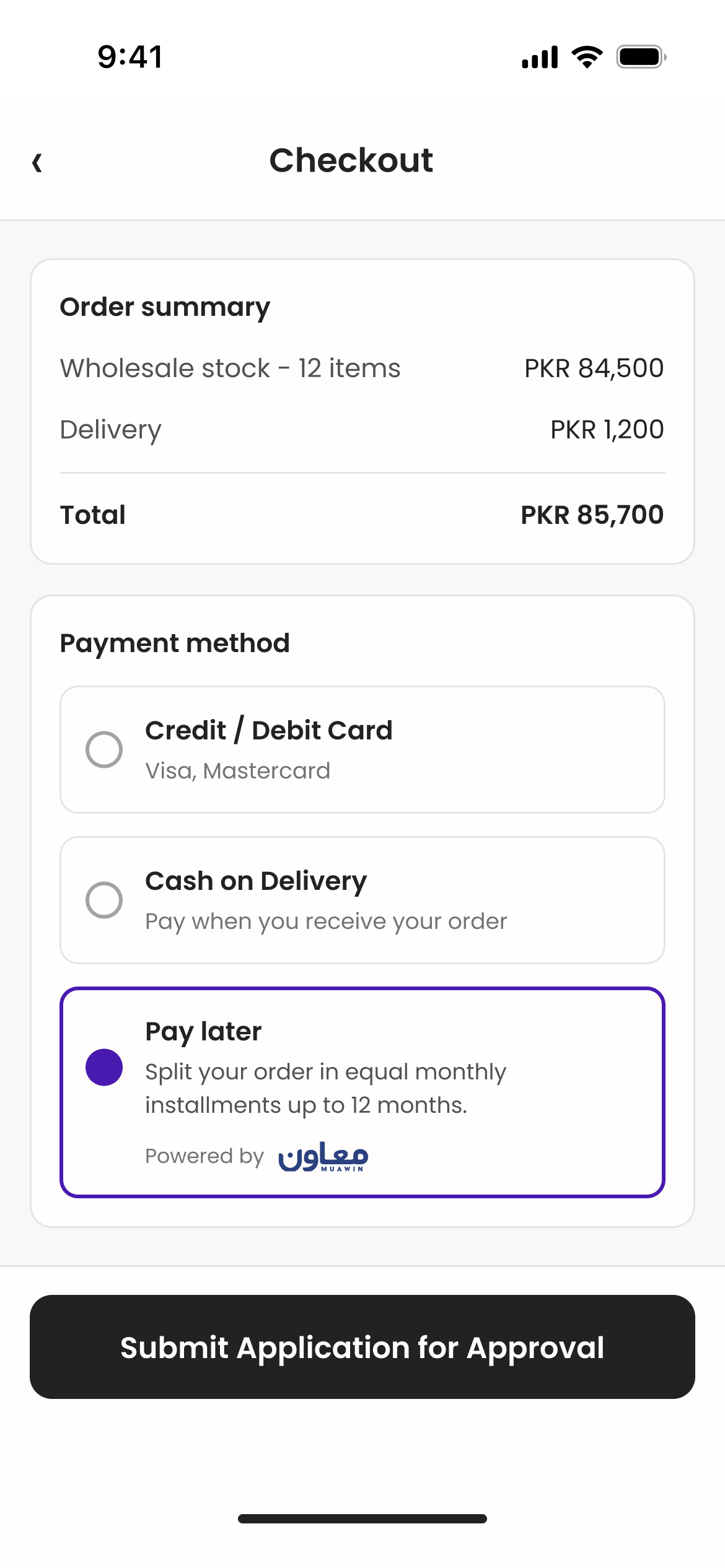
Our first partner was a major grocery delivery app. Store owners who sold through the platform could apply for working capital inside the app and repay out of future delivery earnings.
The central product design question: what data fields does the API require from partners?
Every required field cut both ways. More data meant better credit decisions and more confident auto-approvals. It also meant more integration work for the partner's engineers and another reason to push the project down their backlog.
The design decisions
Mandatory fields kept to a minimum
National ID for identity, transaction history on the partner platform for financial signal, and contact details. All data the partner already held, so integration stayed cheap.
Optional fields improved the model
Employment, other income, tenure on the platform. Partners who sent them earned higher auto-approval rates. Partners who skipped them still worked; more of their cases just went to human review.
The API got smarter with volume
The model learned which signals predicted repayment for each partner's user base. Early integrations leaned on manual review. Mature ones ran mostly on autopilot.
Tradeoff: simplicity vs. signal. An early draft of the API required far more fields so auto-approval rates would look good from day one. Partner feedback during the grocery integration killed it: they would integrate a 5-field API this quarter, a 15-field API never. Tiered fields were the compromise. Launch with low requirements, then earn accuracy as partners opt into sending more.
04 · The Automation Line
Where to put the human in the loop.
The approval engine had to answer one question for every incoming request: can the system decide this, or does a person need to look at it?
Getting it wrong in either direction was expensive. Auto-approve too loosely and defaults climb. Route too much to review and the queue backs up until the same-day SLA snaps.
Three buckets, one threshold to tune
The system used a scoring model that placed every application into one of three buckets.
Auto-approve
High-confidence cases where the data clearly supported approval. Done in seconds, no human involved.
Auto-deny
Hard failures: sanctions hits, failed identity checks, outstanding defaults. Instant and unambiguous.
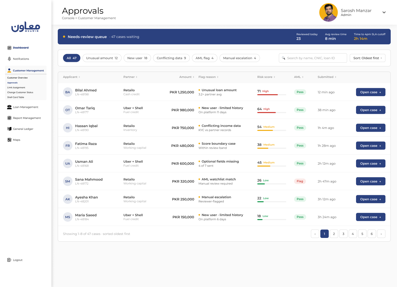
Needs review
Everything in between: inconclusive scores, amounts outside the partner's typical range, thin history, conflicting data. These went to the internal portal.
Where auto-approve ended and needs-review began was the most consequential decision in the product. Conservative meant safe and slow. Aggressive meant fast and risky.
Tradeoff: speed vs. safety. We launched conservative, with roughly 60% of cases auto-decided and 40% routed to review. Every reviewed case taught the model more about what predicted repayment, and the auto rate climbed to 76%. The threshold was designed to move as confidence grew, never set once and forgotten.
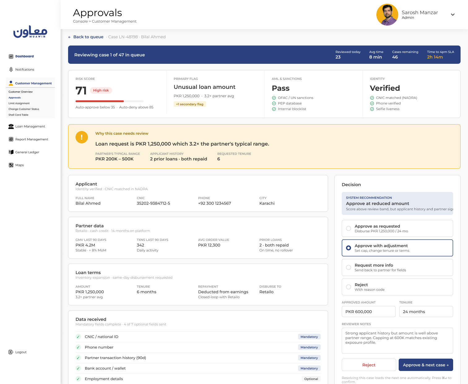
05 · The Needs-Review Portal
The 10-minute review that took all day to reach.
Once a reviewer opened a case, the review itself took about 10 minutes. The queue was the real problem.
Cases arrived all day while reviewers juggled other work. By mid-afternoon dozens could be waiting, each one a person stuck inside a partner's app. Anything unresolved at end of day broke the same-day SLA.
The portal had three jobs: surface signal so reviewers orient in seconds, keep queue velocity high so cases never pile up, and keep decisions consistent from one reviewer to the next.
Design decisions
Four decisions that turned a 10-minute review into a fast, confident call.
Critical signals pinned at the top
Score, triggering flags, and the AML result stayed visible without scrolling. Everything else sat below the fold, available but quiet.
Flag-first case presentation
Every case opened with the reason it was flagged. An unusual loan amount led with the partner's typical range and the applicant's history right beside it.
Queue-optimized workflow
Resolving a case loaded the next one automatically. Approve or deny took a single click. Session stats showed cases done, cases left, and time to the 4pm cutoff so reviewers could pace themselves.
Integrated AML screening
Sanctions and regulatory database checks ran automatically on every case and surfaced as a simple pass or flag.

Tradeoff: depth vs. speed. The first design exposed every data point in an expandable profile. Reviewers said they only needed 3 or 4 signals, yet seeing everything made them feel obligated to check everything, and reviews dragged. The redesign made the critical signals loud and the rest quiet. Decisions got faster because the interface said where to look.
06 · Scaling: The Uber + Shell Integration
Same infrastructure, completely different product.
The grocery integration proved the model. The second one, connecting Uber and Shell, proved the infrastructure could carry a product we never planned for.
Grocery was cash credit: borrow, spend, repay over time. Uber + Shell was in-kind fuel credit. Drivers need fuel to earn, so Muawin scored them on data from both companies (ride history and earnings from Uber, account status from Shell), then asked Shell to top up the driver's fuel card. No cash changed hands. Drivers got fuel and repaid out of their Uber earnings.
What changed in the architecture
Two data sources instead of one
The credit profile drew on Uber and Shell together rather than a single partner's data.
Disbursement went to the supplier
Muawin paid Shell to credit the driver's fuel card. The borrower never touched the money.
Repayment came out of earnings
Collections were deducted from the driver's Uber earnings, a closed loop that cut default risk.
The approval engine and review portal ran unchanged; a credit decision is a credit decision whether the output is cash or fuel. The API layer grew to accept multiple data sources per decision, and disbursement learned to route to a third party. Both were modular extensions of the original design.
Embedding the credit application directly in driver onboarding also cut sign-up time by 50%.
07 · Impact & Outcomes
The numbers after four months.
- 30k+Monthly transactionsAcross partner integrations
- 40%Of company revenueWithin 4 months of launch
- Same-dayApproval turnaroundDown from a one-day cycle
- +36%Transaction growthAfter automated approval shipped
- −50%Driver sign-up timeCredit embedded in Uber onboarding
- 5 citiesPartner rolloutLive 2 months after first integration
- 20k+New users via partnersA 50% lift in user acquisition
- 3× YoYCompany revenue growthAcross all product verticals
Beyond the metrics
A new business line
Muawin went from lending to store owners to running credit rails other companies build on. That reset the company's positioning and its growth path.
Fortune 500 validation
Uber and Shell proved the rails could carry enterprise partners. The fundraising story and the partnership pipeline changed with them.
A compounding flywheel
More volume made the model sharper, which raised auto-approvals, which shrank the queue. And 20,000+ new users arrived through partner channels without direct acquisition spend.
08 · Reflections
What went well, and what I'd do differently.
What went well
The system was the product
The decisions that mattered most had no UI: the API fields, the automation thresholds, the queue workflow. Treating those as design work was the right frame from day one.
The mandatory/optional field model
A stricter API would have scored better on day one and signed fewer partners. Trading early accuracy for adoption, then earning it back with volume, was the right call.
Building for flexibility
Fuel credit was nowhere in the original plan, and the architecture absorbed it anyway. Modular input and output layers paid for themselves within months.
What I'd do differently
Invest in developer experience earlier
Partner engineers were the API's real users. Better docs, a sandbox, and clearer error messages would have cut the hand-holding each integration needed.
Instrument the review portal from day one
We knew the queue was the bottleneck but never measured where reviewers spent time inside a case. That data would have sharpened every iteration.
Formalize threshold changes
Moving the auto-approve line was judgment informed by default rates and queue volume. A written framework with clear triggers would have made it less dependent on gut feel.