UX Design
UX Research
My Role
Led the entire end-to-end design process from research to high-fidelity prototyping.
Result
Delivered a fully interactive prototype optimized for speed, clarity, and real-world usability.
Received an A+ for the project in a University of Michigan Interaction Design course.
Tools
Figma (Prototyping, Design Systems, Auto-layout, Conditional Logic)
Figjam
tl;dr
📌 What I built
A recipe app for busy people that recommends meals based on what’s in their kitchen—and lets them scale servings with one tap.
🎯 The problem
Most recipe apps assume ideal conditions. Users don’t have the right tools, time, or portion guidance—and end up frustrated or ordering takeout.
🧪 What worked
Users loved the serving size slider and step-by-step cooking mode. One usability tweak drastically improved recipe discovery success rate.
🔁 If I had more time
I’d test with more diverse users, add dark mode, and explore turning this into a real MVP.
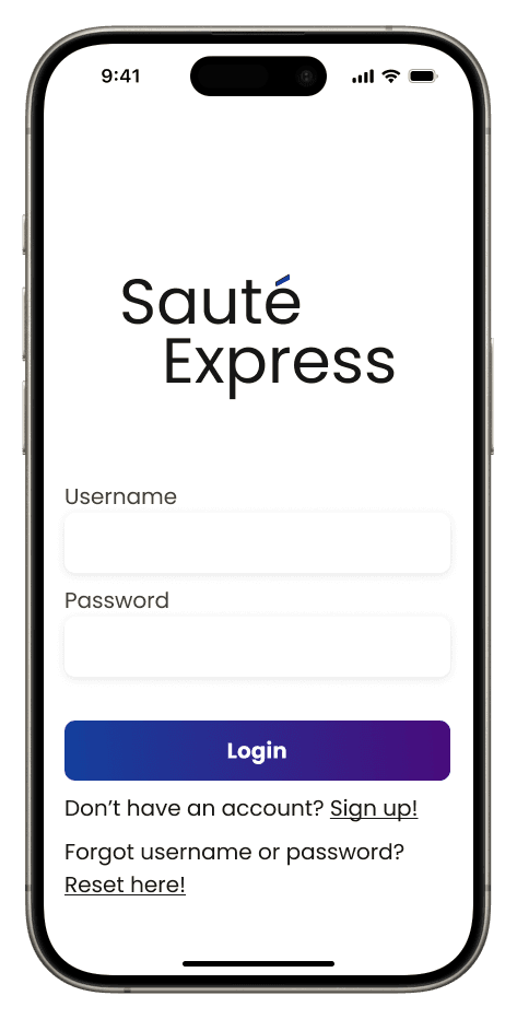
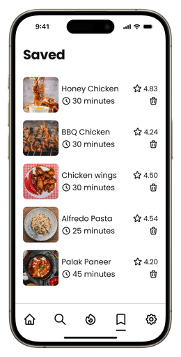


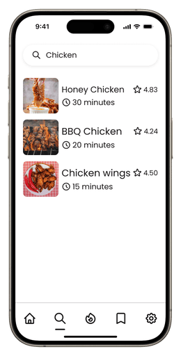

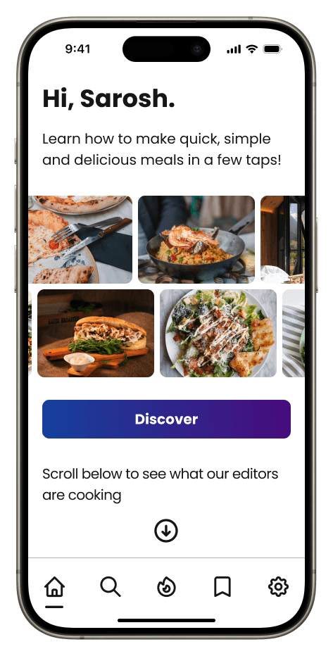
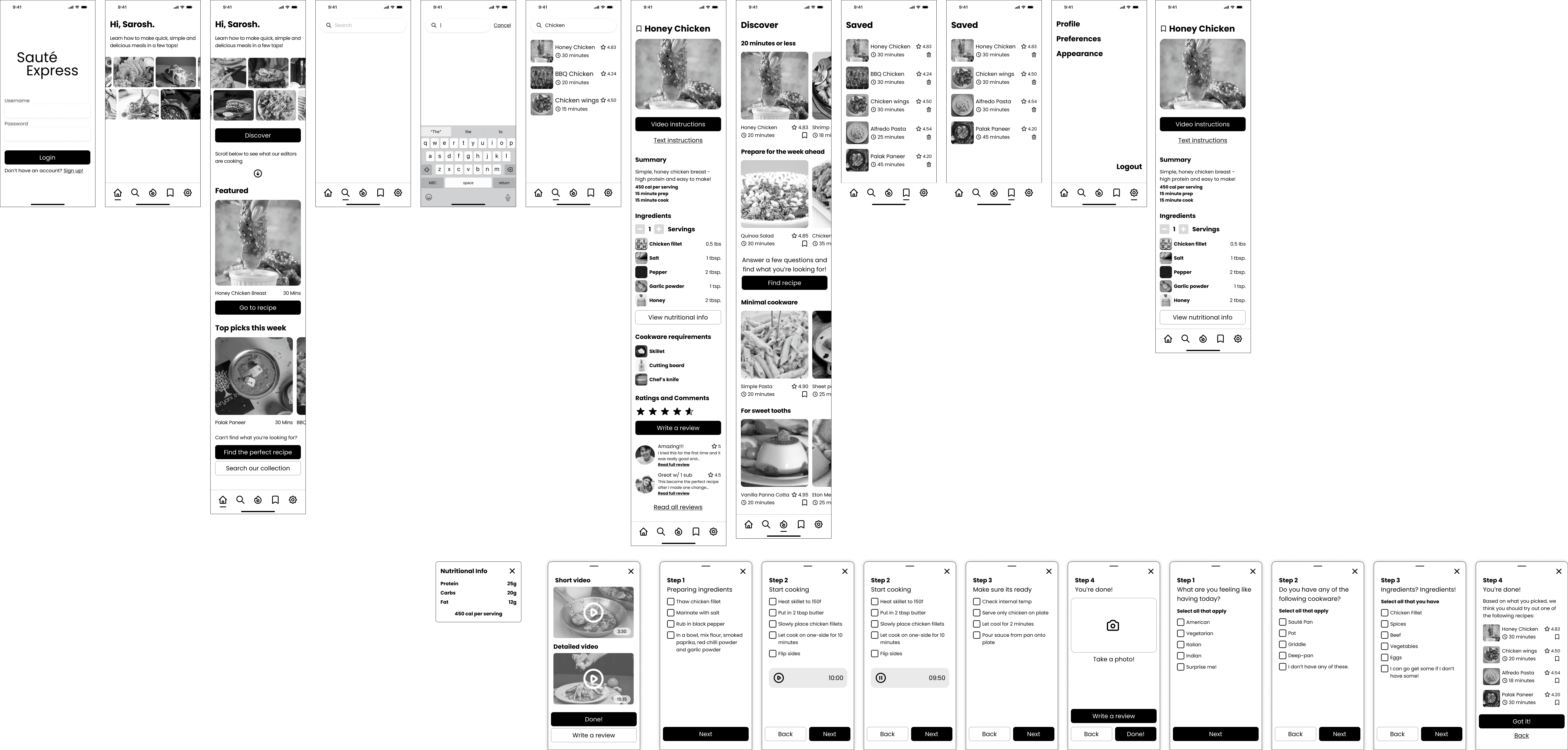
Final Screens

🎯 Objective
Design an app that supports:
Personalized recipe recommendations
Adjustable ingredient portions
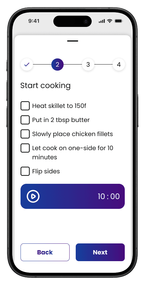
Step-by-step cooking guidance
With only a few weeks for research, I prioritized a focused competitor audit and user interviews to uncover actionable insights quickly.
Competitor Audit
Studied Yummly, Tasty, Mealime, etc.
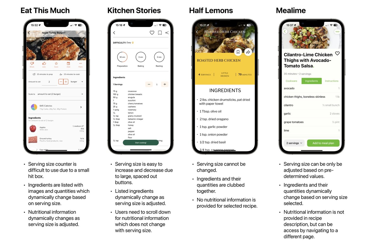
Key Finding: No apps tailored toward batch cooking + real-time tool filtering
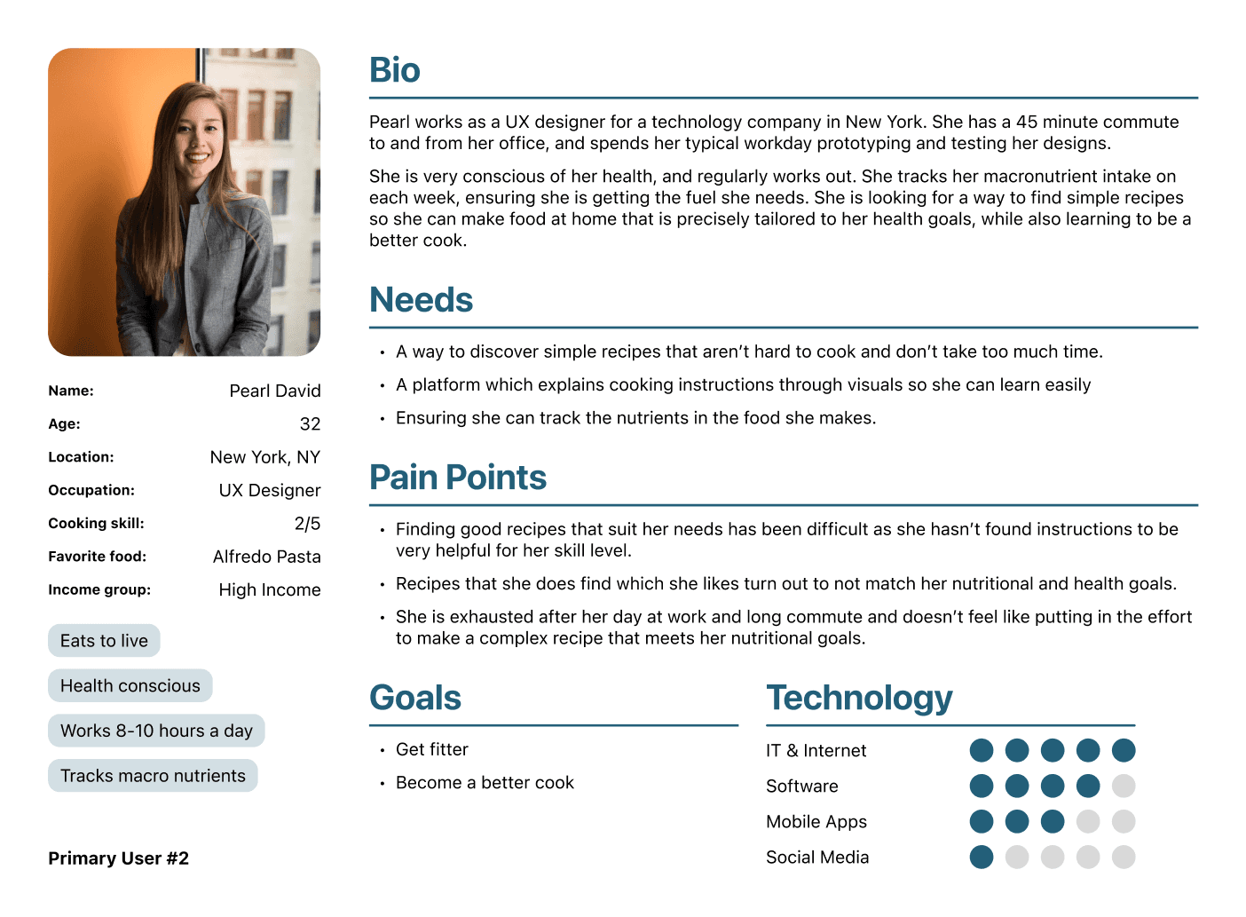
User Interviews
I conducted 5 interviews with students and professionals. Using a 20-question script, I asked about their cooking habits, frustrations, and goals.
Insights
Using insights from the interviews, I created personas to help with the design process and guide decisions around user needs, goals, and constraints.

To turn user insights into actionable design, I started by mapping the full user flow, asking key “How Might We” questions, and identifying the core features defining the experience.
User Flow
Mapped the experience from opening the app to completing a meal. Focused on:
Reducing uncertainty
Supporting constraint-based discovery
Simplifying cooking flow
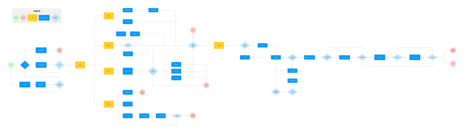
[This probably isn't legible. Here is the full version on Figjam]
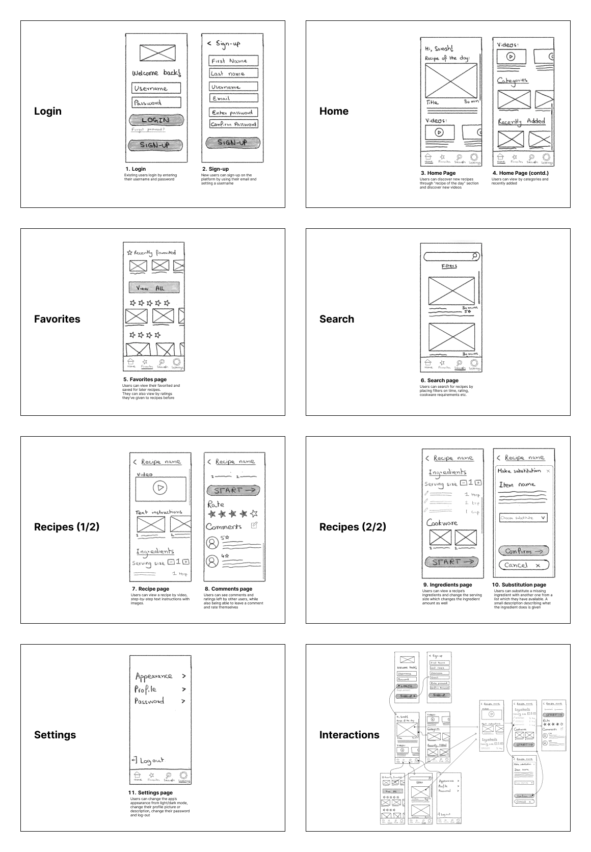
At this stage, I also sketched out some ideas for what the screens might look like
"How might we" exploration
How might we help users feel confident they can make a recipe?
How might we adapt to what they already have?
How might we reduce friction during cooking itself?
Core Feature Concepts
Smart Recipe Finder
Adjustable Serving Size
Step-by-Step Cooking Mode
With ideas prioritized, I began building screens in Figma—from wireframes to high-fidelity flows.
Wireframes
I created mid-fidelity wireframes to simulate real-world interactions early. Used the Pexels plugin to insert imagery and mimic final visuals.
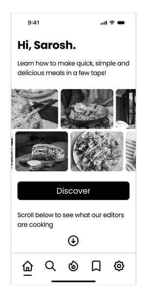
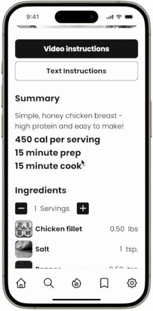
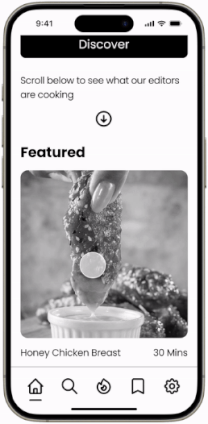
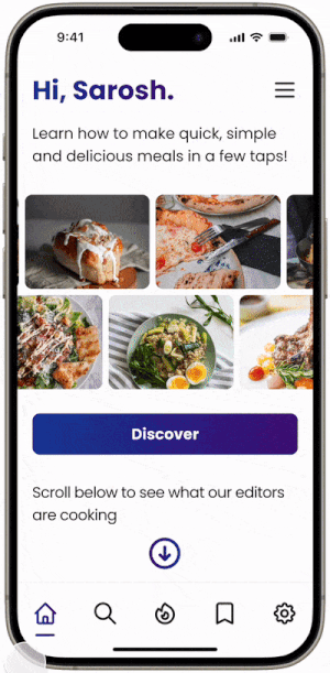
Key Screens
Home
Discover
Recipe Finder
Recipe Detail
Saved Recipes

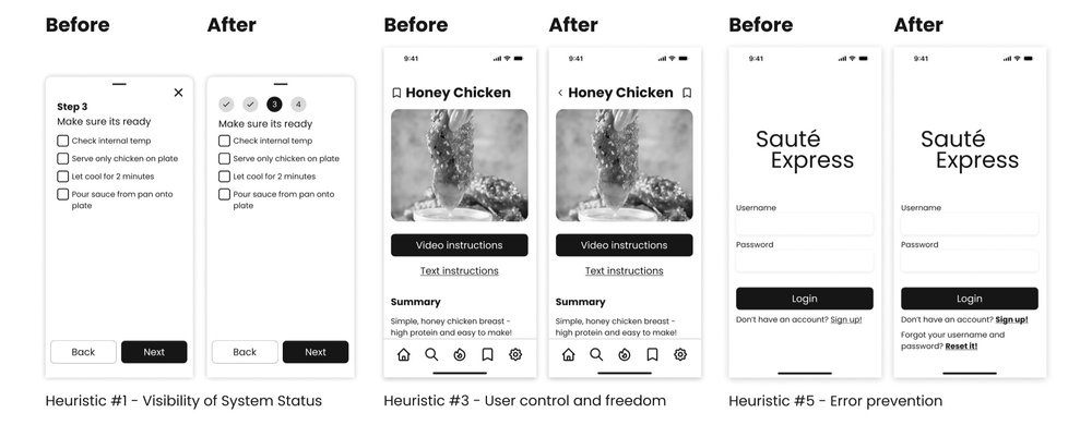
Heuristic Evaluation
I evaluated the wireframes using Nielsen’s 10 usability heuristics. This helped surface early issues that might block users from completing tasks or cause unnecessary confusion.
Problem
Heuristic Violated
Fix
Users couldn’t tell how many recipe steps were left |
|
|
|
|
|
|
|
|
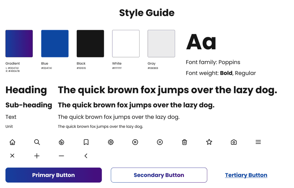
Visual System
With major usability issues resolved, I polished the UI and built out a scalable design system.
Design Choices
Typography: Poppins
Color: Blue/Purple gradient
Iconset: Heroicons
System: Organized Figma asset library with components + variants
I focused on accessibility, consistency, and clear hierarchy.
High-Fidelity Designs
With the design system in place, I translated key flows into high-fidelity screens that reflected the full user experience.
At this stage, I also added animations to make the application feel alive.
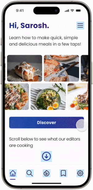
Design Focus Areas
Clear information hierarchy
Tap-friendly touch targets
Scannable, minimalist layouts for cooking mode
Visual continuity with component library
Iteration
With a working prototype, I ran usability testing to validate flows and uncover hidden friction points.
At this stage, I also added animations to make the application feel alive.
Usability Test
Tasks:
Find Smart Finder → ❌
Adjust servings → ✅
Save a recipe → ✅
Problem Found:
The Smart Finder was buried too low on the home page.
Fix Applied:
Moved it to the top with a prominent CTA
→ Retesting showed successful task completion
Other Improvements
Added step counter in Step-by-Step mode
Included persistent back button
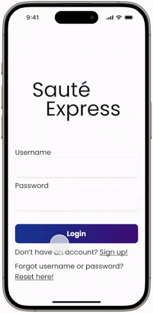
Added “Forgot Password” option for error recovery
Final Screens
With the project wrapped, I looked back on what worked—and what I’d love to explore next.
What Went Well
Research directly shaped product decisions
Quick usability changes led to measurable improvements
Final prototype felt polished and intuitive
What I’d Do Differently
Interview a broader range of users (families, dietary needs)
Add onboarding and personalization
Explore dark mode using Figma variables
Skills Sharpened
End-to-end UX process
Heuristic evaluation
Conditional prototyping
Design systems
Strategic iteration