Mixed Methods UX Research on Snagit
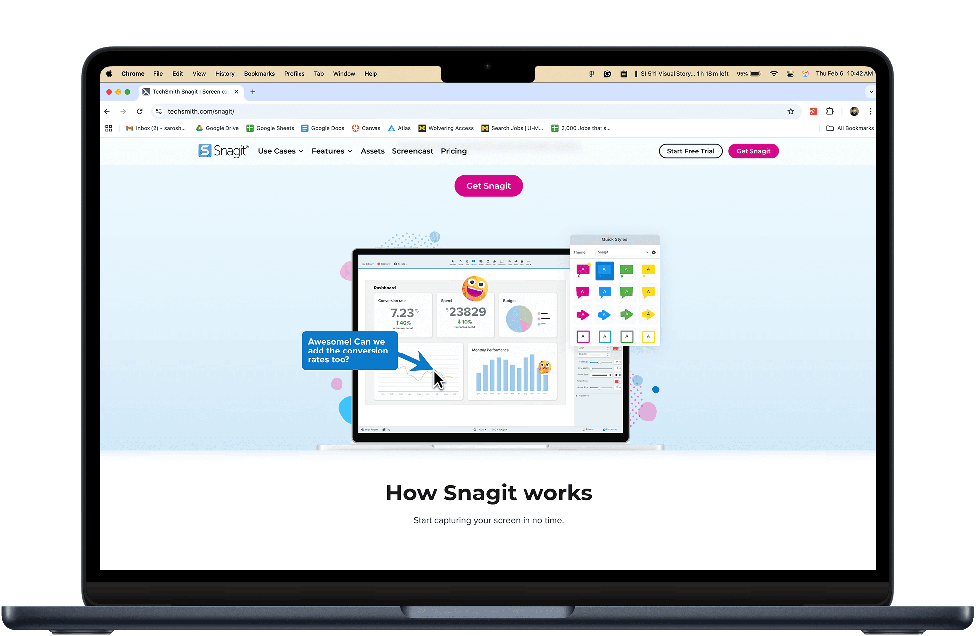
Snagit is an enterprise screen capturing and recording software used by working professions to easily create, edit, and manage screenshots and recordings.
UX Research
Client Work
Project Context
Team
5 Masters Students at the University of Michigan
My Role
UX Researcher
Project Manager
Timeline
January 2024 - April 2024
tl;dr
UX Research investigating usability of a screen capture software
Used 5 research methods:
Interaction maps
User Interviews
Comparative Analysis
Heuristic Evaluations
Usability Tests
4 main findings:
Issues in discoverability
UI Functionality is inconsistent
Visual feedback is a concern
Video capture workflow needs improvement
Next Steps:
Conduct tests with more participants
Design mock-ups
The Problem
"Our users are having a hard time discovering features of Snagit"
-The Client
During our initial meetings with TechSmith's UX team, we focused on understanding what the problem was from their perspective. The client explained that while they had developed a really strong suite of features for their product, very few people seemed to be using them. We inquired further, and figured out 3 main pain points from the client's perspective.
Analytics showed low feature usage
Hover guides for features were available, but not used
Team was busy with the launch of new products
Understand why users couldn't find new features
Figure out how guidance could be improved
Plan
Research
Interaction Map
When we first launched Snagit to understand the software, we were a bit overwhelmed.
There were so many pieces to the puzzle.
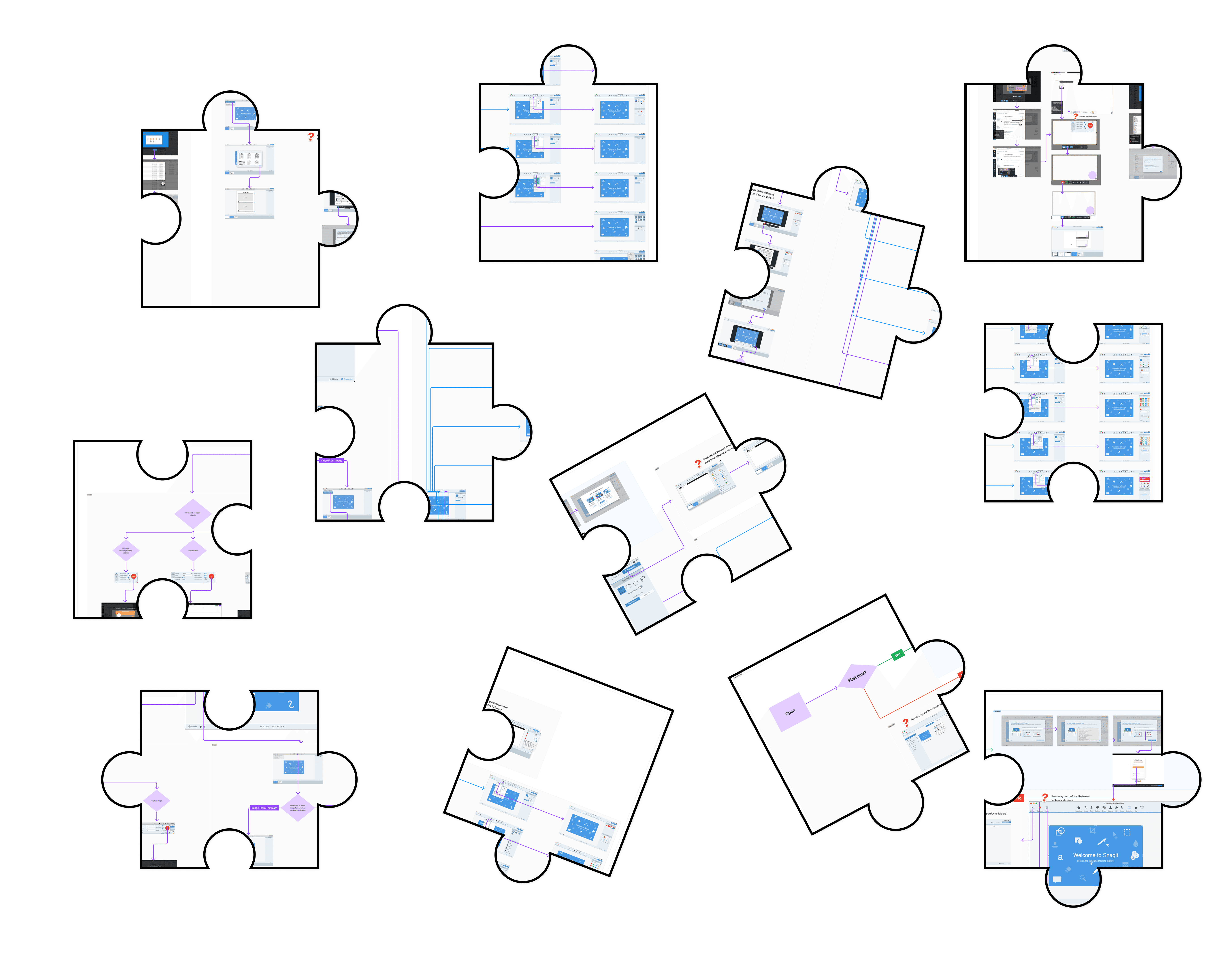
Mapping out the interactions in Snagit helped us solve the puzzle
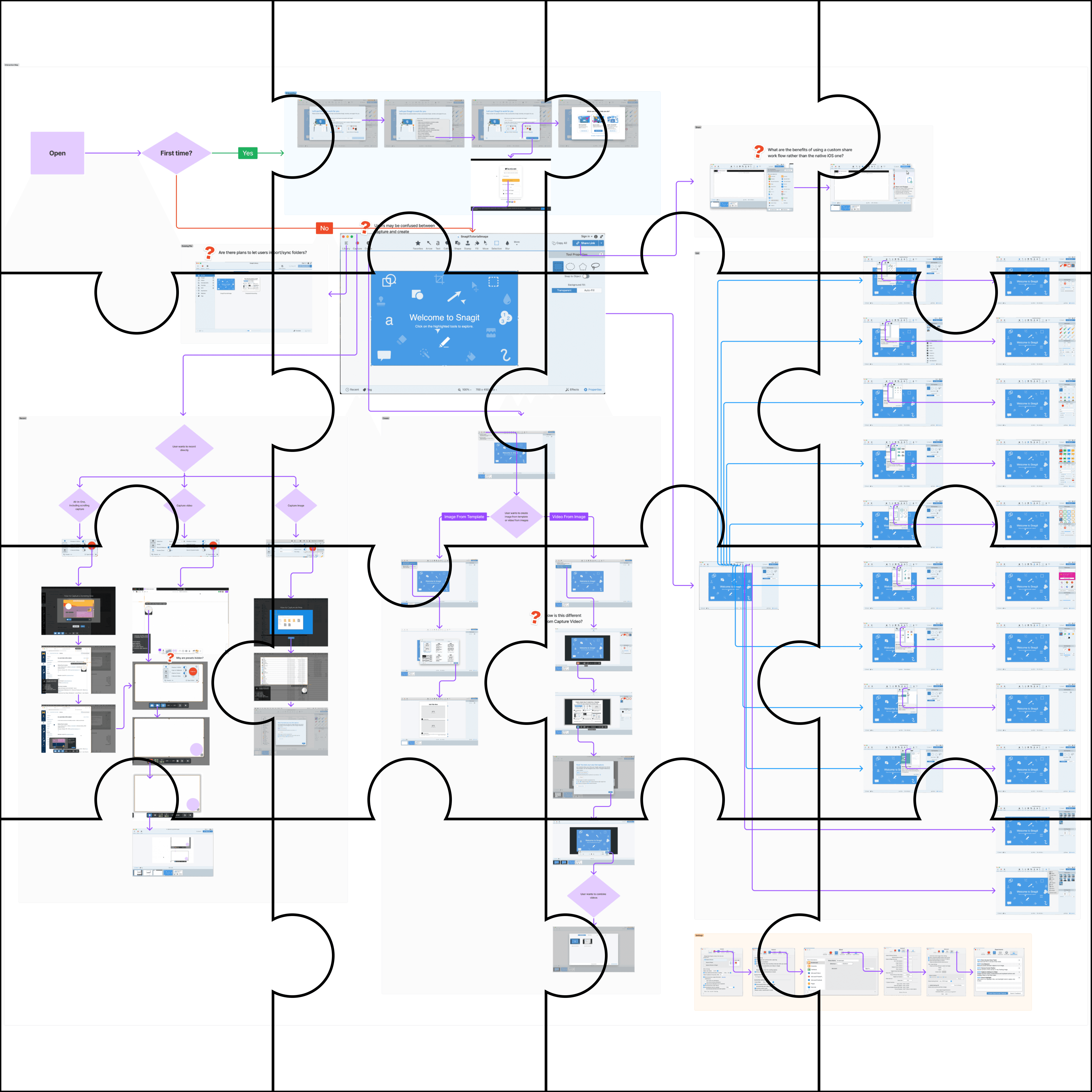
This is a bit hard to read. Here's the hi-res figjam file if you want to see it in detail!
Final Interaction map
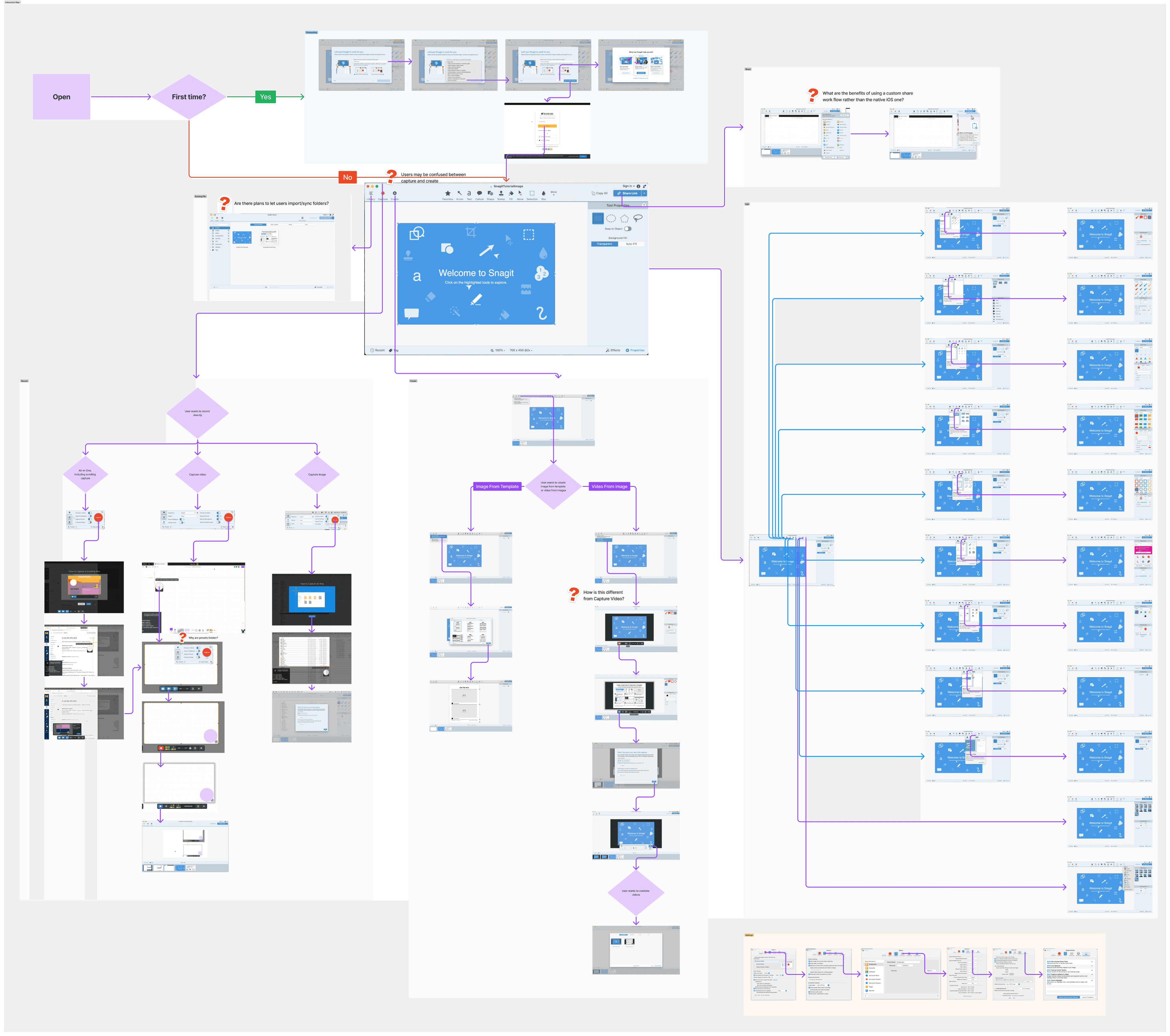
This set up a great foundation for our project
Understanding of the software
Foundation to build research materials
Initial identification of potential issues
User Interviews
Next up, we sought to find out users' experience with Snagit, and also general perspectives and use-cases for screen capture software.
5 total participants
3 Snagit Users
2 non-Snagit users
Our interviews aimed to answer the following questions:
How do working professionals typically use screen capturing software?
What are common challenges that they face while using screen capture software?
How do users interact with tool-tips and software guides?
We had three key findings
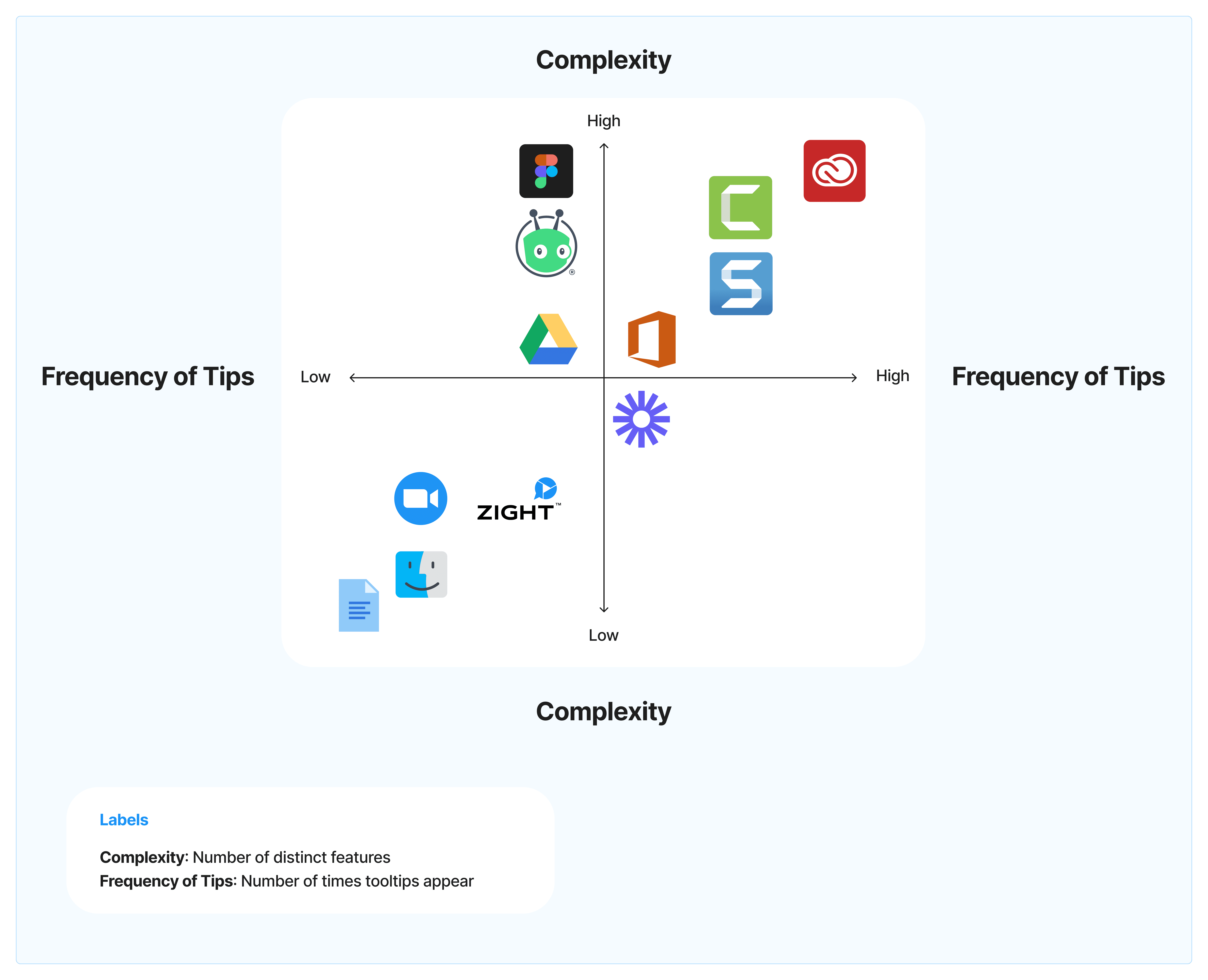
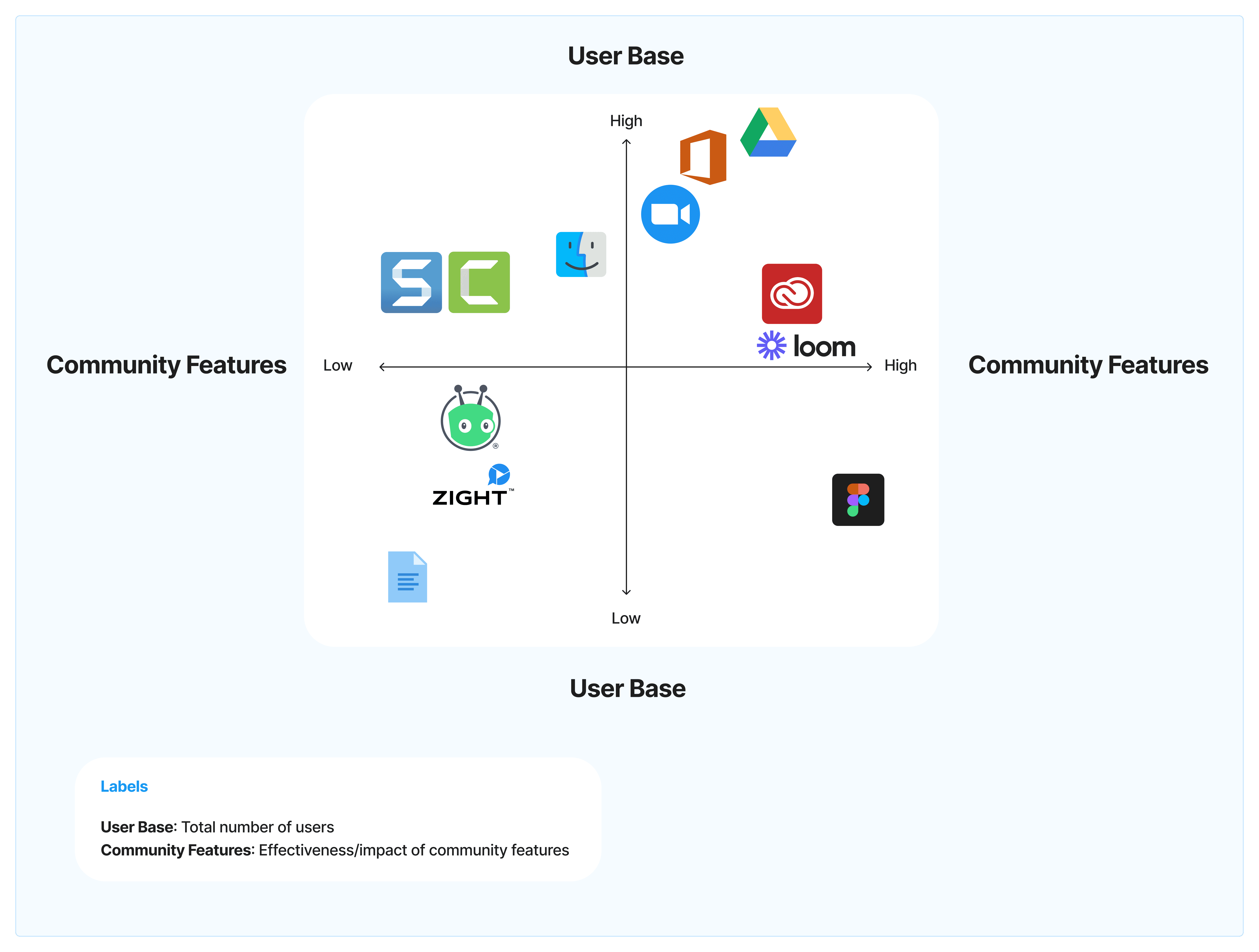
Comparative Analysis
Now that we had an insight into user perspectives, we compared Snagit to other software to investigate how they are solving our users' problems
Direct Competitors


Offer screen capturing or recording features, directly compete with Snagit for the same target audience
Partial Competitors


Offer some overlapping features but also have a broader or slightly different focus
Analogous Competitors

Figjam
Offer creative or design functionalities that could cater to a similar users but for different use cases
Parallel Competitors

Offer related features that could indirectly compete or be used in conjunction with Snagit
Indirect Competitors

Physical documentation
Represent traditional or non-software methods individuals can use as alternatives
We conducted our analysis by coming up with a set of criteria and comparing them amongst all competitors, and then mapping them out in a comparative analysis matrix.

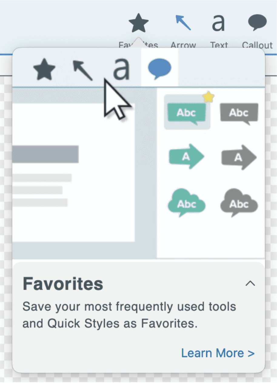
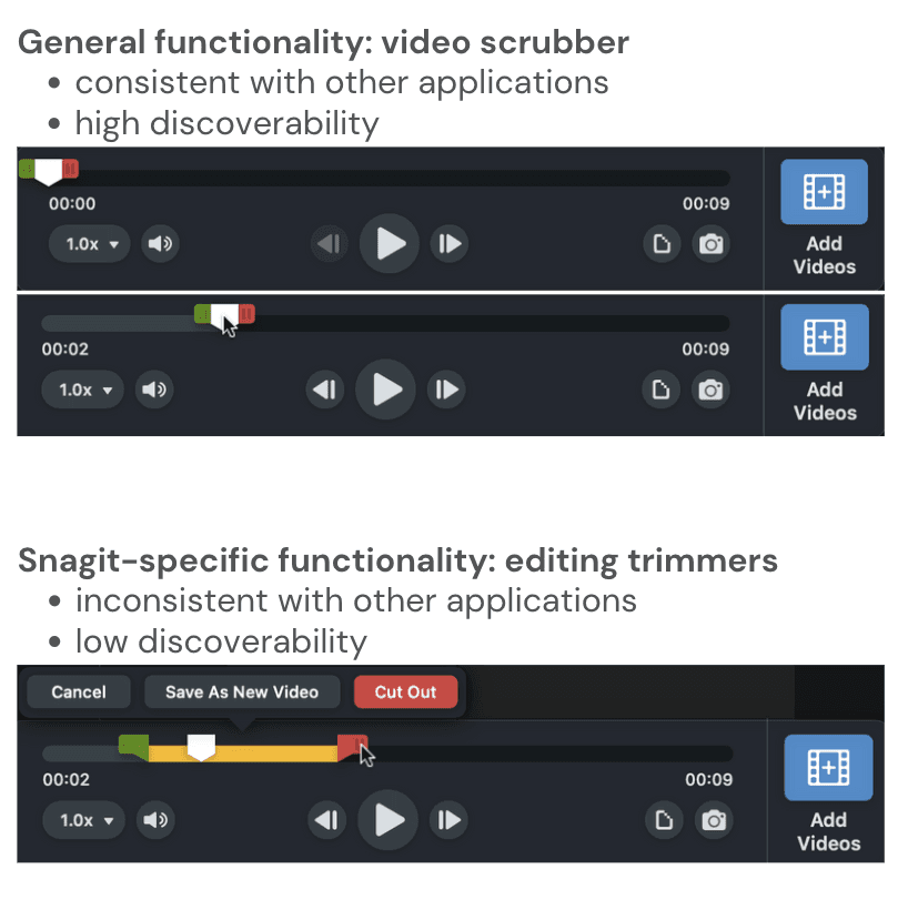
Heuristic Evaluation
Now that we had spoken with users and seen what comparators were doing, we looked inwards toward evaluating Snagit by using Nielsen Norman Group's 10 heuristics for User Interface Design
When we identified a heuristic that was not followed, we gave that feature a severity rating
Here are our most severe observations
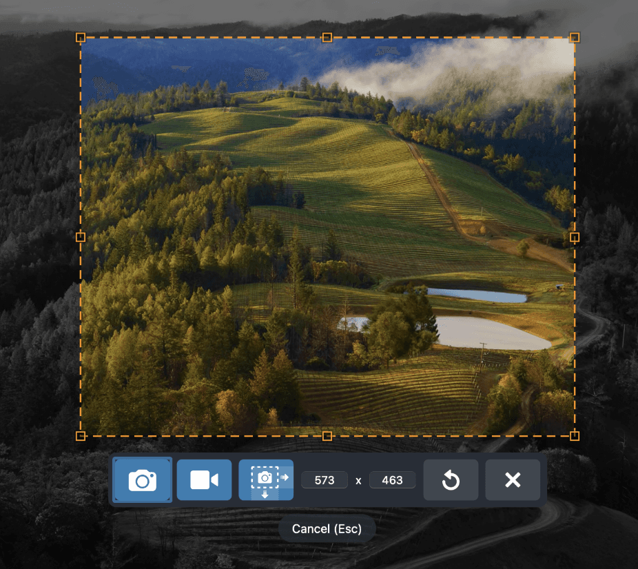
Usability Testing
We ended our research phase by conducting usability tests that allowed us to evaluate Snagit's functionality in a controlled setting
Testing plan
Preamble
Introduce the study and warm-up
Tasks
Run through four tasks with scenarios
Debrief
Inquire about overall experience and impressions
Analyze
Assign task scores and identify major areas on concern
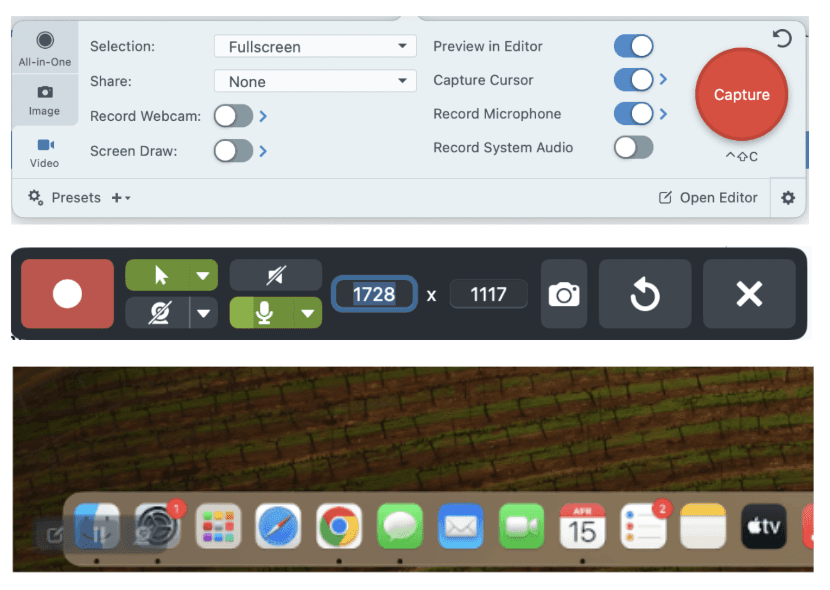
Sample Task
Scenario: Imagine you are working remotely. Your co-worker messages you on slack and asks for help with appearance settings on their computer. You want to show your coworker the settings on your computer so they can copy your configuration.
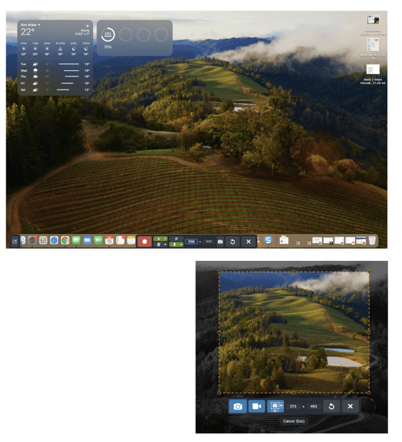
Task #1: Using Snagit, take a screenshot of the appearance settings on your computer
Success Criteria:
In Snagit, user clicks on “Capture”
User uses either “All-in-One” or “Image”
User completes the task in under 7 minutes
We had four key findings

Synthesis
Circling back to our objectives
Now that our research was complete and we had preliminary findings from each method, we aimed to complete our initial objectives
Understand why users couldn't find new features
Figure out how guidance could be improved
Make hover tips consistent across the software and appear with slightly less delay.
Add a visual component over UI elements, which can be hovered over for extra information.
Include more obvious UI elements indicating system status and user actions
Modify the "capture" button for clearer action indication and add prompts to guide users through the recording start process.
Use strategic color contrasts and layout adjustments for better visibility of the control panel.
Implement timestamps and hover effects to improve user control during recording.
Add hover tip, pop-up, or video walkthrough that informs users of intended functionality for pockets of unintuitive navigation
Change the navigation to mimic the user flow that would match user expectations
Reflection
Conducted multiple research methods in a short time-span
Team worked really well together
Client was happy with our output!
Time did not allow us to conduct surveys
Participants could have been more diverse
I wish we had more time to spend on analysis, like doing an affinity map
Conduct Usability tests with more participants
Conduct surveys
Conduct interviews with more participants
Design mock-ups